

CSS Flexbox Cheat-sheet
A quick review to the properties of flexbox for designing interactive user inerface.


What is a flexbox?
It is a one dimensional layout method for arranging elements into rows and columns. "Flex" is a value for "display" property.
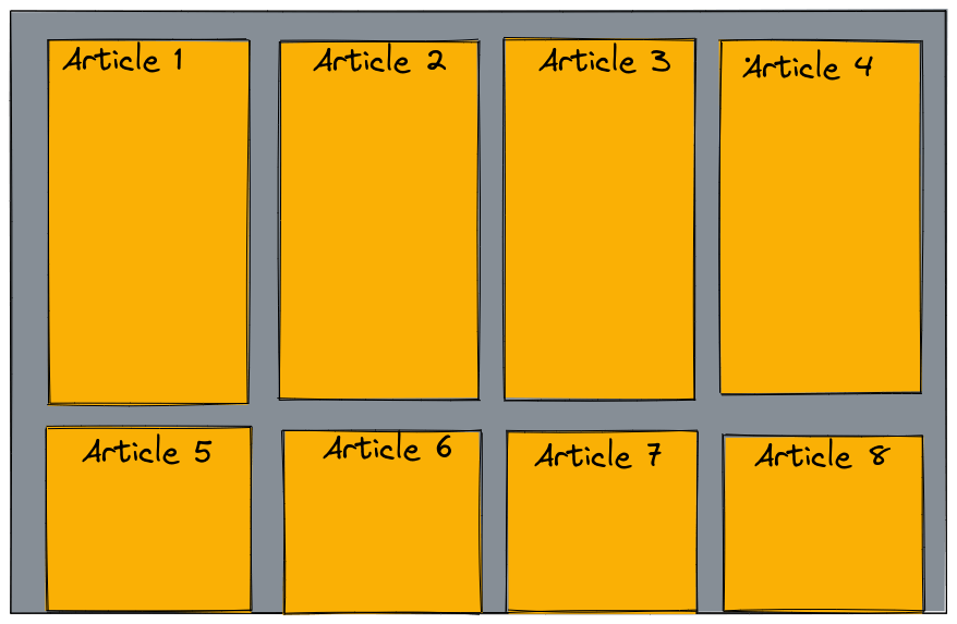
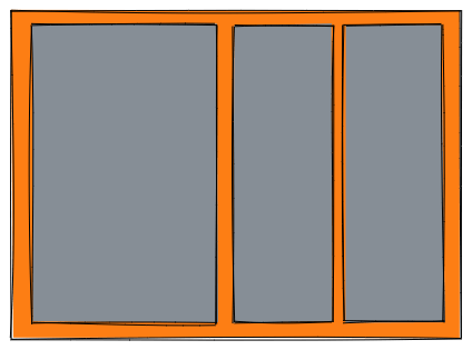
Let's take an example to see what actually a flex box does. Create an interface using HTML and CSS where you have 3 boxes as shown below(illustration 1) aligned vertically.
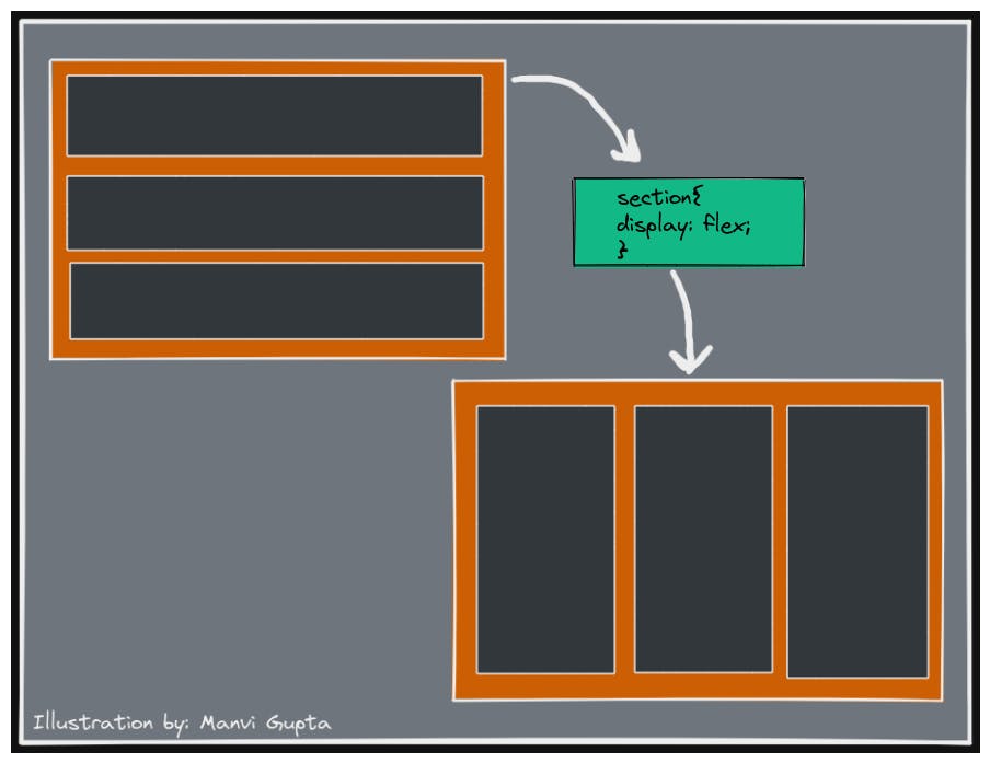
So, with this single declaration we get multiple column layout with equal sized columns, and the columns are all of same height. This is because the default values given to flex items are set up to solve common problems such as this.
The Flex model
(Illustration 2)
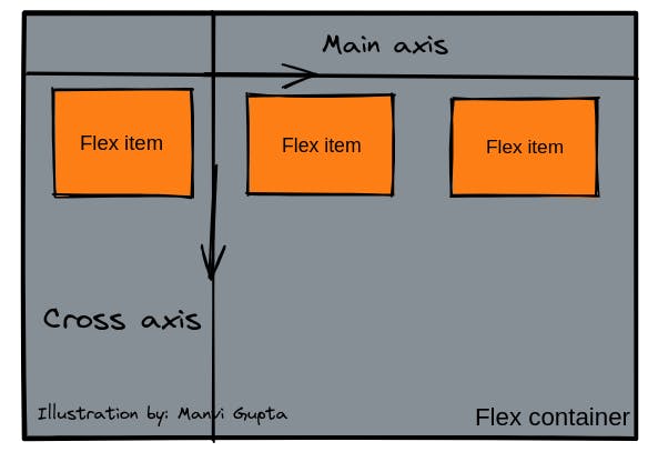
The main axis is the axis running in the direction in which the flex items are laid out in whereas the cross axis is the axis perpendicular to the direction of the main axis. The alignment of items in the flex container takes place along these axis.
Alignment of items in a flex container
The alignment of items inside the flex container takes place by using the different properties provided by flex box.
Properties of flex box
1. Flex-direction: this property is used to align the items in a row or coloumn. The different values that can be given to this property are- row(items will be arranged in a row), coloumn(items will be arranged in a coloumn), coloumn-reverse(the items will be arranged in a coloumn from right to left) and row-reverse(the items will be arranged in a coloumn from bottom to top). The default value of this property is set to row. That means whenever we will declare the value of display as flex the items will automatically be arranged in a row as shown in the 1st illustration above.
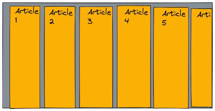
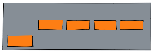
2. Wrapping: One issue that arises when you have a fixed width or height in your layout is that eventually your flexbox children will overflow their container, breaking the layout. (Illustration 3)
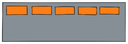
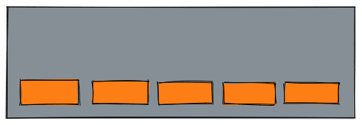
flex-wrap: wrap;
(After declaring this property we will see the changes as shown in Illustration 4)
We now have multiple rows. Each row has as many flexbox children fitted into it as is sensible. Any overflow is moved down to the next line.
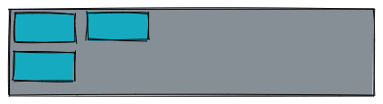
3.Align-items: this defines how the flex items will align along the cross axis.
- By default its value is set to stretch, whic means the flex item will accquire the space of the parent container completely.If the parent container's height is not defined then all the flex items will acquire the height of the container having maximum height.This is how we have equal sized child containers in the first illustration.
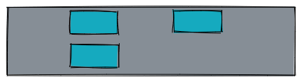
flex-center will align the items to the center of the cross axis as shown below in illustration 5.
align-items: center;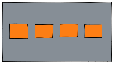
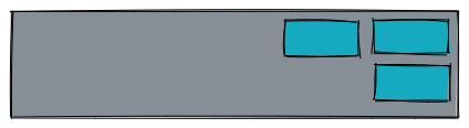
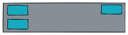
flex-start will align the items in the start of the cross axis as shown below in illustration 6.
align-items: start;
flex-end will align the items in the end of the cross axis as shown below in illustration 7.
align-items: end;
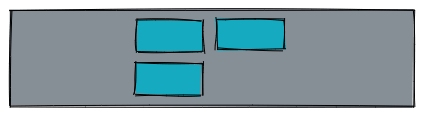
You can override the align-items behavior for individual flex items by applying the align-self property to them. The result is shown below in illustration 8.
button:first-child {
align-self: flex-end;
}
4.justify-content: this will align the flex-items along the main axis.
- The default value is flex-start, which makes all the items sit at the start of the main axis.
justify-content: start;
- flex-end aligns the item to the end of the main axis.
justify-content: end;
- center it align the items to the center of the main axis.
justify-content: center;
- space-between will align the flex iems to the corners of the main axis with the space in between them.
justify-content: space-between;
- space-around will align the items along the main axis such that they have space around them.
justify-content: space-around;

- space-evenly will align the flex items along the main axis such that they have equal space around them.
justify-content: space-evenly;
flex-flow shorthand:
- Instead of using flex-direction and flex-wrap property seperately, we can use the shorthand flex-flow .
flex-flow: row wrap;
flex: shorthand v/s longhand
flex is a shorthand property that can specify upto three different properties.
- flex-grow this is a unitless value which can be used to specify what proportion of space flex items take up compared to the other flex items.
If we go back to the first illusttration and declare the following property we will get the result as shown in the illustration given below.
flex-grow: 1 200px;
This property will apply the size 200px to the first child item and the rest of the space will be taken by the second and the third child item.
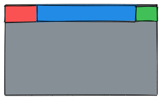
flex-shrink is an another unitless property which comes into play when the flex-items are overflowing their container. It is a relative value, the flex items will shrink relative to the other items. Look at this small code section from css.
  .box1{
     background: red;
     flex-shrink: 3;
   }

  .box2{
      background: blue;
      flex-shrink: 1;
   }

   .box3{
      background: green;
      flex shrink:4;
    }
The output of the code is shown below in the illustrstion.
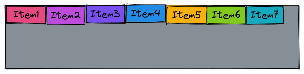
- flex-basis is a property used in place of width. It is used to size the flex items. By default its value is set to auto, which will size the flex items according to the text present inside it. Flex-grow and flex-shrink work on top of flex-basis.
Given below is an illustation where the flex-basis property is set to auto by default.
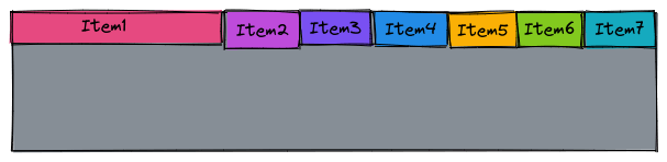
If we set the flex-basis to 200px for item 1, the size of that item will become 200px and the rest of the items will take the space left and arrange them accordingly. flex-basis: 200px;
Summary
The flexbox or flexible box model in CSS is a one-dimensional layout model that has flexible and efficient layouts with distributed spaces among items to control their alignment structure ie., it is a layout model that provides an easy and clean way to arrange items within a container.
Conclusion
I hope this blog helps you learn better and explore more.